Introducing Colored by Kuchar: A New Approach to Showroom & Furniture Color Design That Has Manufacturers Thinking Beyond Standard Colorways
- Sarah
- 20 hours ago
- 6 min read

Photo by Joshua Ford Photography
Clean architectural elements are complemented with soft shades of periwinkle and deep red in the Kuchar-designed Allsteel Chicago Experience Center in Fulton Market.
Walk through almost any showroom, workplace, hospitality environment, or residential project, and one thing becomes immediately clear: color has the power to shape how we experience a space.
It influences mood, creates energy, communicates brand identity, and transforms ordinary environments into memorable ones. Yet when it comes to furniture design, many manufacturers continue to rely on the same predictable palette of standard offerings—safe neutrals designed to appeal to the broadest possible audience.
There is certainly a place for versatility. But there is also an opportunity: to create products that feel more distinctive, more intentional, and more reflective of how people want to live and work today.
That opportunity inspired the launch of Colored by Kuchar.
More than a palette consultation, Colored by Kuchar is a collaborative service that helps furniture manufacturers develop thoughtful, brand-driven color direction for product lines, furniture collections, and showroom environments. Drawing on our experience across residential, hospitality, workplace, retail, and commercial design, we help brands identify opportunities that feel fresh and relevant while maintaining the longevity required for successful product development.
Simply put, we help manufacturers think beyond standard colorways—and discover what color can do for their brand.


In the Kuchar-designed DARRAN showroom, warm, saturated hues complement the space’s rich material palette, creating an immersive showroom experience with a cohesive and inviting atmosphere.
Color Is More Than a Finish
At Kuchar, color has always been one of our most powerful design tools. Whether we're designing homes, restaurants, workplaces, or showrooms, color is often the element that shapes experience, creates connection, and tells a story.
That’s because color is one of the few design elements people don’t simply observe—they interact with it. They sit on it, work beside it, move through it, and experience it every day. Its impact is both visual and emotional.
We often tell clients that color is a language. It communicates who you are, what you value, and how you want people to feel. It can signal confidence, creativity, sophistication, warmth, or innovation. And when used strategically, it becomes one of the most effective ways for a brand to distinguish itself in a crowded marketplace.
The most successful palettes aren't the loudest. They're the most intentional.
Yet many furniture manufacturers still approach color conservatively. Understandably so. For a collection, color is a significant investment. Unlike a coat of paint on a wall, it often remains in place for years. The result is a tendency to default toward familiar finishes and expected neutrals.
But we believe there is plenty of room between “safe” and “risky” to get creative—and, better still, intentional. A muted red can function as a neutral. A rich green can feel timeless rather than trendy. An unexpected contrast stitch, custom leg finish, or thoughtfully paired upholstery can completely transform the perception of a product without sacrificing commercial appeal.

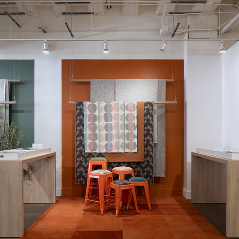

Soft, neutral tones provide a warm and versatile backdrop for product presentations at the CF Stinson showroom, while distinct color zones separate each brand category—providing flexibility for future layouts.
Designing For What's Next
One of the advantages of working across multiple design sectors is the ability to spot patterns before they become mainstream.
In residential projects, we're hearing directly from homeowners about the environments they want to create. In hospitality, we're seeing firsthand how color influences experience and emotion. In workplace settings, we're helping organizations communicate culture and identity through design. Across every project type, we're constantly observing what resonates, what feels oversaturated, and where new opportunities are emerging.
That perspective gives us something valuable to bring to manufacturers: context. We understand what designers are specifying. We understand what end users are asking for. And perhaps most importantly, we understand how to balance trend awareness with longevity.
The goal isn't to chase trends. It's to understand why people are responding to certain colors, combinations, and materials—and translate those insights into solutions that will feel relevant for years rather than seasons.
Our process often begins by pushing a color story further than a client initially expects. We explore possibilities, test ideas, and challenge assumptions before carefully refining and editing. That willingness to think expansively is often what uncovers the ideas that feel most distinctive, authentic, and memorable.

Photo by Joshua Ford Photography
Grounding reds and energizing pops of persimmon and blue act as impactful visual guides for visitors of the Allsteel Chicago Experience showroom.
Case Study: Reimagining the Allsteel Showroom
A recent collaboration with Allsteel offered a compelling example of what can happen when color becomes a strategic design tool.
Ahead of this month’s Chicago Design Week, the team approached us to refresh its Chicago showroom (the Allsteel Chicago Experience Center in Fulton Market)—not simply to modernize the space, but to create a destination that would spark conversation and encourage visitors to experience the environment differently.
The existing showroom was largely white, providing a clean backdrop but little in the way of visual identity. Our solution began with the architecture.
At the center of the showroom sits a large core surrounded by windows. We transformed that feature into a focal point by painting it in Sherwin-Williams' Garrison Red—an earthy, muted red that immediately introduces warmth, energy, and a strong sense of place. Beyond its visual impact, the color also functions as a wayfinding element, helping orient visitors as they move through the space.
Fun fact: This family of reds emerged as a defining color trend across Chicago Design Week, appearing in various interpretations throughout many of the city's showrooms. We're seeing these rich, saturated hues used almost as a new neutral—bringing warmth, depth, and personality to spaces without overwhelming them. In that sense, our selection for Allsteel not only felt right for the brand and the space, but also proved to be ahead of the curve.

Photo by Joshua Ford Photography
Flexible, curved furniture brings a rhythm to the space, allowing Allsteel’s materiality to truly shine.
From there, the palette expanded. Touches—or “winks,” as we like to call them—of the brownish red appear throughout the showroom, creating continuity and rhythm. We balanced those moments with a muted periwinkle—a shade that leans more blue with purple undertones for a softer visual—to greet guests at the entry. Another key space, a lounge we dubbed the “Zen Den,” lives within a blue palette zone we designated. Here, we introduced a persimmon hue to serve as a contrast—a bold interruption to the muted red core.


Photos by Joshua Ford Photography
Focused, intentional touches of energizing teal and deep red define distinct zones while maintaining a cohesive connection to the main areas of the Allsteel showroom.
For the opposite side of the showroom, we opted for a complimentary green palette for another standalone zone. Here, to energize Allsteel’s broadcast room, we drenched the space in variations of teal—a color known to make people feel renewed and rejuvenated.
You have to see and experience it—the nuanced shades, the creative applications, the harmonies within the palettes—to understand the impact.
What makes the approach particularly effective is its flexibility. The showroom now has a stronger identity while allowing future furniture palettes to evolve over time. Most importantly, the furniture remains the hero. From the upholstery to the hard finishes, every color decision we made was designed to support the products rather than compete with them. The result is a showroom that feels dynamic, memorable, and unmistakably Allsteel.
Another fun fact: Allsteel took our recommendation and used their branded, baltic blue hue for the doors within their demountable wall products—a color option they had never put into production for this popular product.


Photos by Joshua Ford Photography
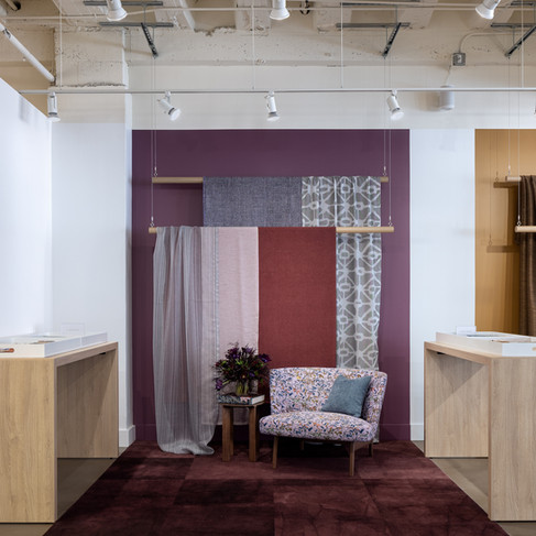
Vibrant baltic blue brings energy, while soft, warm purples foster a sense of calm throughout the Allsteel Chicago Experience showroom and workspaces.
What It Means to Be Colored by Kuchar
For us, Colored by Kuchar is about far more than selecting colors. And it all begins with listening.
Every engagement starts with discovery: understanding a manufacturer's brand, audience, goals, and aspirations. What message are they trying to communicate? How do they want customers to perceive them? What emotions should their showroom and products evoke?
From there, we develop a color direction that supports those objectives while reflecting broader shifts happening across the design landscape. Sometimes that means introducing unexpected pairings. Sometimes it means reimagining familiar colors through a contemporary lens. Sometimes it means identifying opportunities where a small detail—a finish, trim color, contrast stitch, or accent—can create an outsized impact. The outcome will look different for every client, but the philosophy remains the same: thoughtful, innovative, and rooted in purpose.
Looking ahead, we see tremendous opportunities for manufacturers and design firms to collaborate more closely—not only on color direction, but on product innovation as a whole. Because for Kuchar, color has never been just about aesthetics. It's a tool for creating connection, communicating identity, and telling a larger story—one that helps products stand apart and resonate long after the first impression.
For more than a decade, Kuchar has been designing dynamic showrooms in Chicago and around the country for some of the interior design industry’s biggest names, including Scandinavian Spaces, Davis, Bernhardt, Framery, DARRAN, Tarkett, CF Stinson, Allsteel, and more. Check out our full portfolio of commercial work here.
Ready to create your brand’s color story? Contact us today! We can’t wait to hear your unique story—and your vision for the next chapter.