Form, Feeling, & Future: Highlights from 3DaysofDesign 2025
- Emily Osborne
- Jul 14, 2025
- 5 min read
Emily Osborne, Project Designer at Kuchar, reflects on her favorite finds from Copenhagen’s annual design festival — and the enduring shifts reshaping the industry.

After a whirlwind few days in Copenhagen for 3DaysofDesign 2025, I came back to Chicago with a fresh sketchbook, a full camera roll, and a head brimming with ideas. This year’s festival was a masterclass in balancing the future of design with reverence for its roots. From reimagined classics to bold sustainability efforts, what struck me most was how design has evolved — it’s no longer just about how things look, but how they feel, how they're made, and the stories they tell.
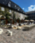
It reminded me why I love what I do. At its best, design reflects not just how we want to live, but who we aspire to be. And Copenhagen — with its cobbled streets, smart infrastructure, and inherently Scandinavian approach to sustainability and functionality — was the perfect backdrop. Every showroom, street installation, and café conversation echoed the same ethos: design should be beautiful, honest, and deeply human.
Here are the trends and takeaways from 3 Days of Design 2025 that left the biggest impression…

A New Palette — Fresh Colors and Surprising Pairings
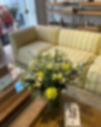
Color is always the first thing I notice; it’s the heartbeat of a space. This year, a few hues really stood out. There was a definite shift away from the creamy ivories and buttery tones we’ve seen over the past few years. Instead, we’re seeing cooler, more grounded palettes. Think celery green, dusty yellows, and surprising pairings like indigo and violet, which brought a kind of bold calmness to many displays.
The Kvadrat showroom, always a color trend leader, leaned into these tones beautifully: refreshing yet grounded, playful but sophisticated. And I loved seeing how Svenskt Tenn mixed traditional patterns with rich, saturated colors — cobalt, sage, camel — bringing a sense of classical Scandinavian restraint paired with moments of joyful boldness.
Even the bicycles around the city seemed to reflect this color shift — I spotted more than a few celery-and-cobalt-hued bikes zipping past showrooms. It felt like a palette that belonged to the city itself.

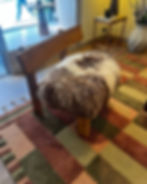
Sculptural and Soft — The Enduring Appeal of Curves
The curved furniture trend? Still going strong, but it’s evolving. Pieces feel even more tactile and amorphous this year, offering not just softness in form, but a more sculptural presence in space.
One standout was the Helsinki-based Roosa Ryhänen — new to me — whose biomorphic seating felt like art installations you could actually use. These pieces are about more than just trend; they speak to the way we want to live: expressively, casually, without hard edges.
At Sancal, the blobby forms took on surprising scales and functions, sometimes defying category. Are you sitting on a bench or a sculpture? The answer is: Both.
Upholstery, Uninterrupted
One major thread running through the showrooms was the rise of fully upholstered pieces, all the way down to the base. Lounge chairs, sofas, even occasional chairs were swathed in fabric from head to toe. It’s a look that communicates softness and immersion — less leggy, more nest-like.
While we love this look at Kuchar, we’re always considering the practicalities. As a designer, I have to ask: how does it stand up to mopping? Cleaning? But I also can’t deny that these pieces make a space feel cohesive and calm. It’s a form-over-function moment that, with the right materials, can work beautifully in residential or boutique hospitality spaces.
Ash and Walnut Take Center Stage
In terms of materials, ash and walnut woods were everywhere, and I was thrilled. We’ve been forecasting this shift for a while at Kuchar, so seeing it play out across so many showrooms was a satisfying confirmation. Ash’s soft, neutral tone and walnut’s rich depth create a warm, natural foundation that pairs beautifully with the cooler color stories happening right now. The way brands were showcasing wood also felt intentional — visible grain, clean finishes, nothing too glossy. A respect for the material itself, which leads me to…

"Keep It Real" — A Return to Authenticity
One of the most powerful undercurrents throughout the festival was a call to authenticity. In a world saturated with simulations and surface-level aesthetics, 3DaysofDesign reminded us to keep it real — literally.
It’s about using materials honestly. Wood is wood. Terrazzo is terrazzo. No printed imitations, no visual trickery. If a product uses repurposed or vintage materials, it’s celebrated, not hidden. The transparency was refreshing and reinforced the value of material integrity in design.
This idea also extended to construction. I saw several installations where designers exposed the process — raw frames, half-upholstered chairs, exploded views of joinery. The House of Finn Juhl showroom really leaned into this, with one window displaying a chair mid-construction. It was a beautiful reminder that what’s underneath is just as important as what’s on the surface.

Sustainability — Beyond the Buzzword
Of course, sustainability was front and center — but not in a buzzy or performative way. It felt more embedded, more mature. Many brands proudly displayed the origins of their materials — upcycled textiles, reclaimed woods, closed-loop production methods.
Speaking to reps, it became clear that sustainability is no longer a nice-to-have; it’s a business imperative. And we, as designers, are part of that equation. Clients often prioritize budget, so it’s on us to communicate how sustainable choices can meet both aesthetic and financial goals. Seeing that echoed across the festival was energizing.

Modern Heritage — Looking Back to Move Forward
Another theme I loved: reinterpreting heritage. Several brands looked to their archives and reissued classic pieces — but in bold colors, new profiles, or updated materials. It wasn’t nostalgia for nostalgia’s sake. It was about honoring what worked, then pushing it forward.
House of Finn Juhl, again, stood out here. Their classics were presented alongside playful twists — updated silhouettes, unexpected upholstery, and modern detailing. It was a celebration of craftsmanship and continuity, without being stuck in the past.
Design as a Community Effort
Finally, one of the things I appreciated most about 3DaysofDesign this year was its collaborative spirit. Many of the best showrooms were multi-line houses, where 20+ brands came together under one thoughtfully curated roof. It saved time, sure, but it also created cross-brand dialogues and unexpected pairings.
Beyond the showrooms, the entire city seemed to join in. Families strolled with kids, locals popped in and out of exhibitions — it wasn’t just an industry event. It was a community celebration of design. And seeing parents introducing children to good design early? That’s the kind of generational thinking that gives me hope for where this field is headed.